Thursday, 15 October 2009

My School Magazine Front Page finished!

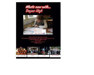
This is the finished front page of my preliminary task 'School magazine'.


I have added a title at the top saying "whats new with... Deyes High" this title is aimed towards a younger audience, giving connotations of a young and new magazine.


I have then added my medium close up picture which is of a girl working, giving connotations of an academic school.


I have included the logo on the front cover to give connotations of a group identity showing they belong to a school community.


Writing which is advertising the school production of Grease is included on the front page, makes people want to read on incase any information about the production is included. This also entices people to take part in the production or to go and watch the show.


I have then used pictures from the internet to cover different areas from school with captions. These are used to entice all different types of groups in school life.


My preliminary task front page draft!


For my preliminary task i have made a school magazine. This is my draft I have made this draft on publisher but when creating this i will create it on photoshop.
Please make any comments about this thanks.

Double Page spread analysis of Q magazine!


I have analysed this two page spread as i felt it would be useful for when i design my own. I can look at the structure and graphology.

The image used shows Shakira sitting in a studio working, indicates her working on her music. Smaller pictures are scattered of her in the She Wolf music video and another of her body with her hand used as a claw, these pictures break up the text and makes it more interesting.

Headings used "access all areas" makes people want to read on as it gives connotations of exclusive and backstage gossip.

I looked at a double page spread of an article from Q magazine, this is very different from the Doves article. This is about a single artist "Shakira" and reviews the singer explaining how she has produced her albums and explaining that there are a lot more to come. Talking specifically about her new song "she wolf", you can see this when the artical states "key players on She Wolf include Williams, Wyclef Jean and Santogold collaborator John Hill, each bringing sophisticated beats, soulful ballads and super-charged electro-pop to the party." Which shows how well thoughtout and planned this track was; showing Shakira's desire to appeal to a wider audience.

This article then changes in to a interview format when Shakira says "I used to be a shy girl, but hey i'm 32 now and i feel compelled to express my thoughts and feelings in a way i might have been more afraid to do in the past." This shows an insight into her life and makes readers feel it is an exclusive interview.

Then they use advertising format saying "The track is due for release as the album's first single in september". This is used to inform the general public about the track and when they can buy it.
Wednesday, 14 October 2009

My analysis of the Doves double page spread!


I have analysed a double page spread from the Mojo Magazine featuring the Kings of Leon on the front cover.

When looking at this double page spread i noticed many things the pictures are scattered around on the page mixing images and text together making the page look more interesting. The main picture is a member of the band playing the guitar with the lighting contrasting the title "Two nights in bird land", which is also a pun headline as the band is called Doves. The other images in black and white gives connotations of tough and shows they are more of a old band.

When looking at the structure of the article it starts off as a review of the Doves and then goes on to talk about the biography. The use of rhetorical questions such as "do you know what i mean?" suggests this was part of an interview talking to the band. Then a discussion about one of the band members dad being a rockstar and him following in his footsteps. Journalisic comments are made throughout the peice such as "that it has" shows them agreeing with the band. A lot of the speech is very colloquial showing it was a relaxed interview and reflects there background. The mention of other artist such as Lady Gaga shows context for a younger audiences.

Finally the little section on the bottom right hand side uses a lot more taboo language which is a lot more informal.

My analysis of NME contents page!


After looking at Q's contents page i looked at NME and noticed that this magazine's contents page is a lot more cluttered and doesnt look as professional.


The image is in the centre of the page and stands out, with a band index on the left hand side.


On the right hand side all the sections are split up so readers can find the stories that interest them.

I also noticed that they include information about how to suscribe to get the magazine.


The use of the words "plus" entices an audience to buy this magazine as it makes them want to read on and makes them feel like they are getting an offer.

My analysis of Q contents page!


I am now looking at starting to create a contents page as i have ideas for my front page. I began by looking at contents pages for different magazines and the layout, Q contents pages are all structured in the same way.


Including a picture on the right hand side of a band featured attracting your attention, including the page number where this band is featured.


A title "features" on the left in red making it stand out with all the different artists and stories included with page numbers and a slight story indicating what will be on this page.


Underneath it includes a band special and this time is an "Oasis special" including interviews, exclusive pictures and songs mentioned.


Underneath this i have noticed there is a section again in red saying "Every Month" which includes Q mail, subscriptions and a crossword; this will be kept the same every month as it is included in every issue.


There is another section split up called review which will be reviewing all the music as it states "the world's biggest and best music guide". This section is also neatly laid out and includes another image.


Altogether the layout of Q's contents page very effective being neat and splitting the sections up to allow readers to find pages easily.

My written analysis of Mojo magazine front cover!


When looking at the front cover of Mojo magazine the title is always kept the same, this helps the readers identify the magazine from others.

The colour scheme is always changed depending on the artist, most are black and white with a hint of colour. This one for example as the Kings of Leon CD uses green a lot the magazine also reflects this with the green colour scheme.

This magazine always neat and professional looking and gives connoatations of being a up market magazine.

The picture of the Kings of Leon with the main singer in the front draws your attention straight to the picture, the main singer is the most attractive also so can attract a female audience. Using black and white for the band gives them more of a 'rugged' look.

The use of words like "exclusive" and "free" makes people feel as if they are getting an offer or brand new stories and exclusive access these words convey hidden meanings tempting people to want to read the magazine.

The phrase "On the road with the world's biggest rock band!" also entices an audience as they may want to get to know the new up and coming rock band.

The mention of different artists also widens the audience; Sex pistols can entice a bigger audience as it is a well known group and more for the older generation.


My analysis of Mojo magazine.


Before going on to write up my analysis of Mojo magazine i have wrote notes to include. Here i have noticed key features of the magazine which will enable me to look at the layout of front covers.

Friday, 9 October 2009

Case study on artist that fits my genre.


Case study on James Morrison

For my artist on the front cover of my magazine, I have chosen a single artist who plays the acoustic guitar. His genre would follow James Morrison's which is soft rock, using only his guitar and voice.
James Morrison was born in Britain and is a huge hit with his debut single in 2006 “you give me something” which was very popular in Europe, Australia and Japan. James Morrison followed a very similar life to my artist who is featured on my front cover, learning as a teenager he progressed.
http://en.wikipedia.org/wiki/James_Morrison_(singer)
I found some useful information about this artist on this website and used some of the information.
Looking at a professional artist helped me follow this style in creating my magazine. Please make any comments thanks!

Wednesday, 7 October 2009

Labelled analysis of Q magazine front cover


This is a front cover which i labelled first before writing my analysis of it, i labelled the key features which i noticed this magazine had used.